28/06/2009

Cloud Project

I’m sure Show 2 at the RCA will be remembered by many as the place they’d been when this week’s shocking news broke. My graduating friend, Zoe Papadopoulou, hadn’t been in touch for a while and when I saw how busy she’d been pimping this ice cream van, I completely understood why.


Emulating cloud activity and nanotechnology, she sort of served up the essence of extracted flavours without the substance. The project was intended to highlight current nano-scale experimentation that aims to influence the biosphere as a whole, especially the release of CO2. All this and nice graphics too!


I’m guilty of not having seen the rest of the show, though my partner spent ages seeking out new design innovations… if some men love bicycles and radios so dearly, how come they crave seeing them constantly reinvented?

14/06/2009

Artist's Rides


• Francis Picabia, 1940

• Yvonne Rainer, 1950

07/06/2009

Table


Seeing another article on Japanese artist Yayoi Kusama yesterday reminded me of a recent dinner with old pal, Virgene Valout… so many intriguing objects in her home (including Bingo the cat) it would’ve been rude to start photographing them all, so I settled for this spotty table.

31/05/2009

Open Studio

Though next weekend sees another Open Studio event at GWS, it’ll be the last at the present site. The Lost Goods Building will soon be making way for London’s utterly superfluous Crossrail project. Many of the artists, designers and makers will be relocating just a few meters up the road, but I still reckon they’ll be hell-bent on selling everything super-cheap.


I’ll be doing my usual frantic bazaar of discontinued styles and slight seconds at 50p, maybe some drawings and tentatively testing out a couple of ceramic bits too. It’s taken a while for me to work out a molding method that gives me acceptably consistent but unique results.


Open Studios
June 6th & 7th 12-6pm
Great Western Studios
The Lost Goods Building
Great Western Road
London W9 3NY

23/05/2009

Shutting Shops

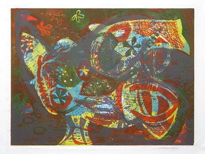
I’ve been away for a while and trying to avoid crashing back to everyday life with a bump, I took a more meandering route to the studio only to see one of my favourite junk shops gutted with the shutters down. Run by a couple of slightly camp geezer-types with bifocals on elegant chains and pyramids of dog-ends in the ashtray, they had a tattered but extensive dictionary of artists and if someone’s name was in it, prices would soar.moya cozens framed bird printMostly I treated it as a mini-museum, I’d had a handful of interesting things over the years (like this gloomy Moya Cozens print) but to think of the curios I’d earmarked selling at everything-must-go prices in my absence just makes me shudder. Still, as one-door closes another opens, quite literally; there’s a lovely new bike shop a few doors down.

22/04/2009

Bob & Blossom


Bob & Blossom have a straightforward, positive approach to development, production and promotion. Adapting designs for a range of their quality children’s t-shirts was effortless and enjoyable… I hope it shows.

13/04/2009

Early Years


Releasing new products in a shrinking market is hardly sound business acumen, if I was ever in this for the money though, I’d be sorely disheartened by now. I’d wanted to produce childrens' birthday designs for a while, but couldn’t reconcile myself to the idea of hand-printing multiple variants. Glad I finally came round to it... the results (Birthday Bus and Bertha) are quite sweet.

07/04/2009

Easter

Screen print still life of crocuses and boiled egg

• Bel Cowie, Easter Egg, screen print, 1979
I stumbled across this scrappy print in a tub of the usual discarded posters of footballers and dolphins. A stock study I’m sure I once would’ve hated, I now find myself drawn to its earthy domesticity. True, most of the seven colours are drab variations of 70s tobacco but the flat areas of pattern and the dubious dual perspective lend the print a quiet audacity. Maybe someday I'll even frame it.

26/03/2009

Overlapping Colour


17/03/2009

Spring!


As spring becomes more promising with each passing day, my seasonal mug for Melt and their Selfridges concession should be available any moment. Here’s one of the rejected designs… which may or may not have been my favourite.

05/03/2009

Tiles #2


Some items seem somehow different as soon as you learn a little about the processes behind them. Here are some of the tiles that lay/hang around my home in varying degrees of decoration/uselessness. The second one is like the world’s toughest cheese on toast.

With news that the recession will see fewer donations and greater custom at charity shops, I doubt this collection will ever swell to Sheila Hughes proportions.

  • Lisa Larson for Gustavsberg, Sweden
  • Cemar, Italy
  • US Plastics, Sweden
  • Pilkington, England
  • Unmarked

22/02/2009

Tiles


I usually set aside Monday night for pottery practice in a small local workshop. I’m still something of a novice, but it’s good learning about glazes and skills on the wheel… the hard way. Mostly it makes a change from printing or click-clicking a mouse. I’d recommend it, though I’m still unsure whether to try something in multiple to tie in with the cards, or keep them as separate as possible.

16/02/2009

Inked Edges

Perhaps I’m easily pleased, but it gave a little thrill to see coloured page edges emerging from an Amazon package last week. Imagining untold others had passed me by, I had a one-handed search of the shelves during breakfast. Sure enough, there were a handful of drab hues (burgundy, black and something akin to moth’s wing), but it was these vintage volumes that truly paid off.
photograph of colorful ink-edged pages of vintage book volumes

A pity there’s been no discernable revival of this detailing; either on editions from bibliophilic publishers like McSweeny’s, the former Black Sparrow Press, Persephone Books, retro-obsessive book-jacket designers like Chip Kidd… or just notebooks even!

10/02/2009

Valentines


Foolishly, I cast a critical eye over my portfolio before sending it out recently and so began a weekend of rushed/radical update. Ransacking the archives (a bag in a box in a cupboard), I came across these valentines; some of 12 completed last year for Otto Trading in Japan (a curiously beneath-the-radar company considering they licence both Barbapapa and Curious George). With full-colour outside-and-in and a complete Pantone choice on envelopes, they certainly do things differently… such a pity then that our Japanese agent is soon shutting-up shop.

02/02/2009

Snow Business

Anxious Snowman
Wow, so much snow in London today! I watched the neighbours’ kids build a snowman… then sweep it into a cardboard box. Perhaps they imagined it’d keep until next year.
  
Here’s Charles Schultz, creator of Peanuts, circa 1930. It's as though his laconic, beleaguered snowman portends the characters to come.

24/01/2009

Congratulations USA

We Want Roosevelt keepsake
This Democrats' campaign handkerchief from the 1930s or 40s has hung on my wall—in one place or another—for as long as I can remember. I’d all but stopped noticing it until recently. 12 square inches like an LP cover, the palette of primary colours reminds me of airmail letters, time-bleached rosettes and tickertape parades.

Sufferage Flyer
Given the choice of political memorabilia, I’d pass even on Paris ’68 agitprop in favour of Womens‘ Suffrage. There’s something about those colours (purple, white and green) that seem utterly modern, eschewing the fusty heraldry of Trade Unionism like a gelato advert with an extra toppings of righteous indignation and bitter commitment.

18/01/2009

Love/Hate

still life with valentines cards and red things
The drying rack was creaking beneath the weight of pink card this week as we geared up for Valentines. Sometimes it’s easy to forget, but printing any design for the first time reminds me why I started doing all this in the first place.

11/01/2009

Saul Steinberg

My mum tells me that Maggie Thatcher lives in Dulwich and there’s definitely the whiff of the conservative in how little the suburb’s altered in the last 150 years-or-so. My visit to the Picture Gallery was rushed, paying scant regard to the handful of great masters in the permanent collection and making instead for Illuminations, the retrospective of Romanian/American illustrator Saul Steinberg.


Illuminations should grab the attention of anyone with a passing interest in contemporary illustration. Moving, as it does, through the social and stylistic changes of the 20th century… though not necessarily in chronological order, esoteric themes seem to rise, recede or recur over decades. Photomontage; faux-naïf assemblage; dour Eastern Bloc surrealism; simple line drawings of hopelessly complex subjects, all eventually give way to a brand of post-modernity you’d expect from Raw Magazine or the Memphis Group.
  
  
It’s the quieter, more personal still life and interior studies that occasionally, affectingly cut through the clamour, though with its startling similarity to Audi’s excellent animated ad, it’s a pity this portrait in a box wasn’t also included. Here’s hoping this show inaugurates a new wave of timely and knowing exhibitions that ensure I’ll visit again… though next time I’ll check-out tea and cake in the café too.

02/01/2009

Happy New Year!

Vintage menu for Royal Albert Hall
Nice graphics on this old New Year flyer found in a junk shop recently. Clever use of an economical two-colour process and the hand-rendered type is great. I also love the way somebody’s written the date a second time, like they only read their own writing.
Vintage menu for Royal Albert Hall
Not sure who’s the more odious character though, the guy for throwing over 1965 in an instant or 1966 for being so easily bought. Just wait ‘til he notices how her hand sometimes grows an extra digit, it’ll be out-with-the-old-and-in-with-new come 1967.
Vintage menu for Royal Albert Hall