Showing posts with label Graphics. Show all posts
Showing posts with label Graphics. Show all posts
25/08/2014
Made pretty good use of a well-rainy bank holiday by heading off to Ivan Chermayeff: Cut and Paste at Bexhill's De La Warr Pavilion. Such a sunny, cheerful show. The kid's creative area didn't particularly interest the boy, though he did spend a while in front of the accompanying documentary… before demanding Octonauts on the iPlayer.
Image: Drinking Fountain, 1969. Via AIGA Design Archives
08/08/2014
This season our fluorescent Octopus print is juggling junk in the Good Stuff section of ANORAK magazine. All press is a plus, though a mention from something you admire is much better!
04/07/2014
Reading Nina Stibbe's Love Nina this month has been a joy, not only does it evoke a strong sense of time and place (literary Camden in the 1980s), it's quietly hilarious too.
Nina's missives are so astute that the whole reads like a loosely structured but knowing narrative, written with all the cultural/emotional bite that's usually brought by hindsight.
Sad to say the hardcover jacket's a bit blah, while the new paperback cover's a travesty of ill-fitting populism… the US edition's my favourite so far.
15/04/2014
We spent the best part of last week eating our way around the London streets like Pacman. Moments before I booked an hotel, a friend offered us her garden studio flat. In the light of these beautiful spring mornings, it felt more like a summer house.
I'd intended to visit more galleries but so many were between shows. I did check out the Serpentine's additional new Sackler Space though. Martino Gamper: Design is a State of Mind is well-paired to the concurrent Haim Steinbach show, Once Again the World is Flat; both explore notions of display and place the shelf centre stage. The show flows seamlessly into a shop that's curated by Momosan.
The boy stayed with his grandparents and had an exhibition of his own... in crayon on their wallpaper! We all came back a little bit fatter.
17/01/2014
Tasche & Tapete
Google translates this as 'Bags & Wallpaper', it's the title of a 2014 calendar that utilises some of the old geometric patterns we made for gift wrap way back in 2006. I didn't even need to search through old artwork, Dumont grabbed the files from a CD accompanying the book, Cutting Edge Patterns and Textures, Estel Vilaseca, 2008.
Each of the initial three designs were named after some of the heraldic bears that lived in Ludwig Hoffmann's Bärenzwinger at Köllnischen Park, Berlin: Tilo, Maxi and Shnute. We caught sight of them once in the depth of winter when the sensible bears are catching serious shut-eye.
• b/w bear pics, 1950 and 1983, via the German Federal Archives
06/11/2013
P+P II
Is it really 5 years since 'Press + Pull', the first show of power-pattern prints from Kate Gibb (work pictured) and James Brown? It seems like only yesterday. In another 5 years I guess 'Press + Pull II' will feel like only yesterday... but really it starts tomorrow.
Press + Pull II, The Stour Space, 7 Roach Rd, Tower Hamlets, E3 2PA
Press + Pull II, The Stour Space, 7 Roach Rd, Tower Hamlets, E3 2PA
20/09/2013
Life
If you're not running too late you can glimpse the curious new Design Museum taking shape behind the hoardings on route to Kensington Olympia... not that Olympia didn't have enough curios of its own at Top Drawer trade fair earlier this week. It's been predictably good to catch up with old friends (now stockists), Black Bough and some of our oldest friends (also now stockists), Present London.
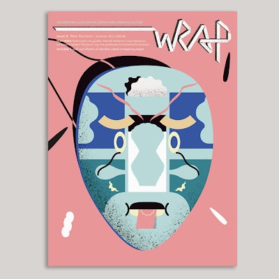
It wasn't all familiar faces though, we spent a few days in the spirited company of Joy, Anna and Rose of London Pooch and Anna Wright, even getting to meet Polly, one half of pattern-mad design duo, Wrap. While I admit the current copy (No.8) is my first, at least I can check out those back issues while I wait for more!
Too preoccupied to scour the charity shops proper, we did find a copy of Charlotte Salomon's (1917—1943) extraordinary document Life? or Theatre? in Oxfam, W8. This untimely 836 page tome dates from the early 1940s and forms a dream-like diary, or early graphic novel, where each gouache panel becomes a fevered or fluid artwork in its own right.
30/08/2013
Wrapper's Delight

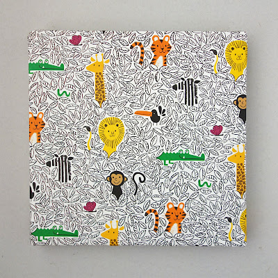
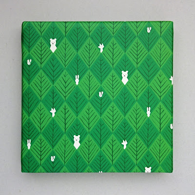
This is our third selection of recycled gift-wrap. I can’t say we’d been especially eager to make any more in the intervening years, but eventually you idly imagine, ‘that might make a nice pattern,’ enough times that another batch is ready-to-roll.
I'm so pleased we did.
You can see those old, discontinued styles from 2006 and 2008 on our scrappy archive page. If you can spookily guess what book is gift wrapped for these pictures, I'll send you a set of the new stuff. Good luck!
19/07/2013
Sunny Day
Pigbag's Sunny Day is not exactly my favourite track, but it is one of my favourite sleeves; which explains why it's sat fading at the front of the 7" box all these years.
Not far away sits this little string dispenser (though I don't know who made it, when, or from what), these two abstract cousins in blue and red form a vital part of Team Bookcase.
23/06/2013
Late, Great
Some 1st birthday cards are worth waiting for… even nearly a month! And here's the proof. You can see more beautiful work from Kate Queen-of-Colour Gibb right here. It ain't all done with computers, you know.
No, kid, please don't put that in your big wet mouth. Oh, you insist? Okay. Er, oh…
31/05/2013
ASCII!
As the adult incarnation of the archetypal nerdy kid, I've always enjoyed reading. Conversely, Edward didn't really read a book until sometime in his mid-teens. These days we seldom make it to the end of an email, baby food recipe, or some review for anti-wrinkle cream. It's hard to imagine we ever expressed an opinion on the future of the novel.
I recently took a pile of experimental 'ideas' novels along to the charity shop, though not before photographing their exceptional dust jackets. All bearing a kind of stylistic date-stamp, the first cover, Project for a Revolution in New York, is an excellent graphic example of ASCII.

Six Memos for the Next Millennium differs in that it's not a novel, but comes highly recommended by hordes of those-in-the-know. All I remember is some mythological account of the creation of coral. (While Ovid's Perseus rests, petrifying blood from the severed Medusa's head spills onto seaweed.) And why it sticks in my mind, I'm not quite sure. Maybe it's the arbitrary genesis of a strange and delicate beauty from such noxious horror, or just the idea of sleeping soundly by the shore.
28/09/2012
Puzzled
07/09/2012
Most Eksellent
Sköna Skämt is an international survey of cartoonists and, while its contents are broadly mired in the politics of the period (1985), the alphabetised chapter headings by Swedish designer, Olle Eksell, have aged with exceptional grace. I know it's wrong to destroy a book, but they'll make the greatest children's wall frieze. And how did I choose which letters to scan here? They all appear in Lisa Jones Studio, of course. Yep, I really am that childish!
29/06/2012
Fingers & Thumbs
Our crappy studio sprang a leak during the UK's last soggy fortnight. While shifting stuff out of harm's way we rediscovered a nice poster and a naïve etching. Edward spent a sweary day framing them up (don't mention the huge gap at the foot of the black one). The poster's not just gobbledegook (or double-dutch) though, if you've not heard her, Yma Sumac was a loopy sounding Peruvian soprano associated with the exotica movement.
17/05/2012
Our Love

Donna Summer (1948-2012) featured on a handful of popular culture's finest moments, for sure, but that AIDS-as-punishment-from-God controversy was a real stinker and no mistake. Here's the only link I can find to 1979's Our Love, a track not really cited in today's obituaries though I love the Acid touches at the end/drum pattern on the chorus... and so did New Order! The images are Gran Fury's late 80s agitprop for ACT UP, to whom she later apologised.
27/04/2012
The Write Stuff
Well, what with The Bard's birthday and World Book Night #2, it's been one belletristic week. Also on the subject of writing, it's been National Stationery Day... no, honestly. Keen to stress the tactile, visual or creative aspects of old-time communication in the age of email, National Stationery Day arrives alongside a 30% hike in postal prices that should ensure the letter's luxury status, and maybe seal its fate.
29/03/2012


Nice to see the BBC use Faber & Faber's preferred font, Albertus, throughout the otherwise unremarkable Arena documentary The Dreams of William Golding. "Unprecedented access to the unpublished diaries" did little to dull the image of Golding teaching while writing bombastic boys books destined only to be taught. Yet between those well-known works, sodden with allegory, there's a peculiar, less noisy novelist. I'm unsure what led me to some of the in-between works, Free Fall (1959) for instance, the truly odd Darkness Visible (1979), or the late literary romp The Paper Men (1984), but they're all still there on the shelf; a watermark of sorts. Sometimes I half expect to find Golding's imagined town, Stillborn, out there on Google Maps.
Subscribe to:
Posts (Atom)


