skip to main |
skip to sidebar

Spent fireworks always had a residual spark of melancholy in their rain-run colour and obliterated graphics. I still have trouble reconciling these earth-bound, day-lit husks with their sulphurous spectacle at night.
There's a flurry of fluorescent post-it notes in my 1977 edition of Art of the Modern Potter, mostly marking Ruth Duckworth's pages. This short feature on her touring retrospective is a few years old, but makes for an exceptionally inspiring 7 minutes.
 Forget restless spirits and trick-or-treaters this Halloween, it's these guys that rule on my street after dark.
 Have I mentioned I Choose You! recently? Here's a couple of ideas for end-papers ousted from the project. We were eager for the book not to start and finish too abruptly, fortunately a third proposal made the grade.


A random stream of numbers maybe, but they're poetry to me... I've never had an ISBN. We've been designing and illustrating I Choose You! for far longer than its simplicity suggests.
Ever since the contractual copies arrived, I've been losing five minutes here-and-there, idly picking it up, intently flicking through or, occasionally, even smelling the thing. And, yup, it smells just as good as a good picture-book should.
Sixteen characterful creatures with Joanna Skipwith's rampageous rhymes on 40 FSC colour pages, 978-0955265235 is available for wholesale from the publisher, Silver Jungle, or retails via their online store.
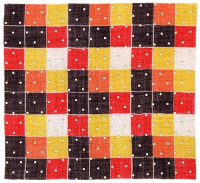
The perils of doubling-up the clothes on your hangers. Difficult to wear at the best of times, this dress had been hidden from view 'til it was far too cold already.

Before I forget and a new issue comes out, I'm interviewed in UK Handmade's online quarterly. Of course, I'm not suggesting you cherish my every word, but the rest of the magazine's well worth investigation. Eco-living, arts and crafts, a smattering of horticulture and, most importantly... food!I do wish I'd hoovered before the picture was taken.

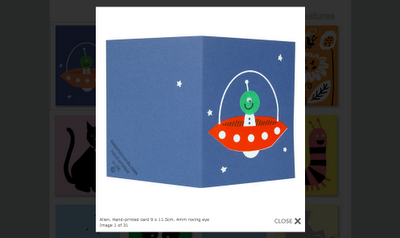
We've been working on a handful of new designs, though some may prove too seasonal to become regular greetings. This little fella has the exact same colour-palatte as last night's ultra-autumnal pumpkin risotto.
A couple of old pals have exhibitions this month; Neil Tait has an overview of a year’s painting at the White Cube while, a few streets further east, Steven Claydon’s pieces completely disorientate a themed show at The Drawing Room.

More selfishly, I get to scoff waffles and take delivery of my new Acne trousers (so much cheaper in Scandinavia) as warm-hearted wunderkind, Daniel Rybakken, brings his deceptively icy brand of modernism to Norwegian Prototypes as part of London Design Festival.


There had to be a good reason for being at Preston Flea Market one freezing afternoon last year and perhaps this little Poole plate was it. Titled Summer II, its harvest theme is right on the cusp of autumn. The effect of the scene is a contrast I enjoy in real life too, when everything’s struck bright with sunlight against the gloom.
• Summer II, 6” plate by Barbara Fürstenhöfer for Poole, 1980

I realise Paul Riley hasn’t devised a way of getting fresh water to remote African villages, but he’s still a hero. From a few scrappy files, hundreds of images and garbled suggestions riddled with bad terminology, he fashioned our wonderful new website.
That’s not to say there wasn’t a little grumbling about the workload vs. the miniscule timeframe and budget. Look at it this way Paul, at least I kept you from skulking off to the skate park every five minutes; broken bones heal slowly at our age!
If I had more lives to live I’d begin another blog, an inventory of scraps found marking the pages in used books. So far I have tickets (old, new, foreign and familiar); photographs; curious confectionery wrappers; shopping lists and two full letters!

This A4 invite to Ambit’s 1985 Art Show was a good find. From the pages of a Louis MacNeice poetry collection, it’s not so much a colour copy as an ancient Xerox with coloured toner.

Aside from citations in arts articles, my knowledge of Ambit’s output is fairly limited; the current show upstairs at east London’s Raven Row has helped fill the gaps. As ever, and much to my chagrin, Paolozzi’s work from The Jet Age Compendium makes screen printing seem a vehicle of boundless possibilities.

Occasionally visitors will break monotony at the studio, one-off meetings or regulars for tea and sympathy. Especially welcome recently were Ayako (from Japanese agent Tiny Crown) and her wonderful son, Haruniwa. Spotting all the potential perils in the studio takes a keen eye, but there’s never been such happy distraction from work!

Next time perhaps I’ll bring my camera too, that way you’ll see far more of them and a bit less of us.

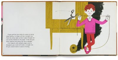
• Straight Lines, Parallel Lines, Perpendicular Lines, Mannis Charosh (illus. Enrico Arno), Black, 1970
Minus the tragedy, my annual dream of summer... maybe next year.
 • Summer Interlude, 1951 (Images, Ingmar Bergman, Bloomsbury, 1994).

I swear we need some worker elves; it seems like months since we decided to adapt two print designs for fairtrade organic tea towels. Of course it was a breeze out-sourcing the printing, but just as we’re through with quality control, packaging and branding, everyone’s off on their summer hols!

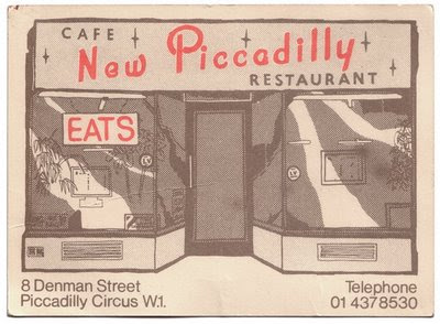

I’m not sure why ‘ephemera’ (the grouping for flies that hatch and die within a day) has come to describe so well those unclassified scraps of paper that narrowly avoid the bin. Cycling by London’s old New Piccadilly Cafe, clad now in diagonal batons of fly-poster proofing, I’m pleased I kept their card.
Finally finished the month-long move into a studio on the other side of town. The new space comes with no fewer than ten keys… directly symbolic of the minutes it now takes to unlock each door.

My trusty old print bench proved just too big to budge, but now the new one’s up and in I think it maybe growing on me a little; clunky as a piece of De Stijl design and red as the Ettore Sottsass Valentine typewriter.

I’m sure Show 2 at the RCA will be remembered by many as the place they’d been when this week’s shocking news broke. My graduating friend, Zoe Papadopoulou, hadn’t been in touch for a while and when I saw how busy she’d been pimping this ice cream van, I completely understood why.

Emulating cloud activity and nanotechnology, she sort of served up the essence of extracted flavours without the substance. The project was intended to highlight current nano-scale experimentation that aims to influence the biosphere as a whole, especially the release of CO2. All this and nice graphics too!

I’m guilty of not having seen the rest of the show, though my partner spent ages seeking out new design innovations… if some men love bicycles and radios so dearly, how come they crave seeing them constantly reinvented?


• Francis Picabia, 1940
• Yvonne Rainer, 1950


 • Summer Interlude, 1951 (Images, Ingmar Bergman, Bloomsbury, 1994).





 Posts
Posts


