31/10/2013

Whooo


This wonderful sculpture is part of a series in marble by thinky artist, Ryan Gander. Based largely on the sheet-covered dens his young daughter created indoors, this one's perfect for Halloween.

• Ryan Gander, Tell My Mother Not To Worry (ii), Marble, 2012

25/10/2013

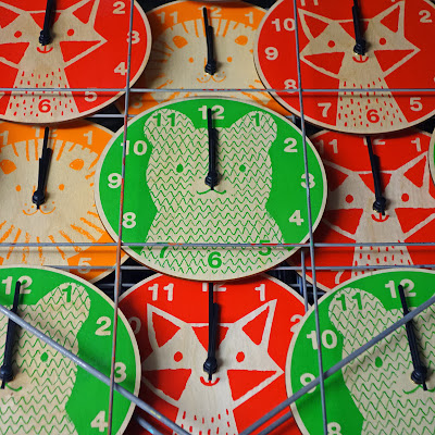
Super-Ply Guys

Bear clock, fox clock, lion clock

This week we received another batch of plywood circles and set to work printing new whiskered critters to accompany our Cat Clock; a Lion, a Bear and a Fox. (Given that the boy identifies animals largely by the sounds they make, I never really know what to do for foxes; that ill-pitched, desperate cry that suddenly cleaves the night? I don't think so.)

pizza boxes pimped with coloured corners
I could also take the opportunity to say that all UK clocks switch to daylight saving time this weekend, but it's funny when befuddled people do things slightly out of sync, so just forget I mentioned it.

19/10/2013

While impending global apocalyptic catastrophe is the major drawback of climate change, a lesser effect is the way we came to greet unseasonably warm days with suspicion rather than joy. This week we ignored the the quarterly tax return and hit the beach at Hove for an hour-or-so. If days are limited, we figure we should make the most of them and choose a route home that takes in the patisserie too.

18/10/2013

Not-So-Dumb

De la War Pavillion, Bexhill-on-Sea

Turner prize winning artist, Mark Leckey, made my son cry. Not directly, of course, but with his rave-like anthropological room in The Universal Addressability of Dumb Things. Curated by Leckey, the exhibition outlines an idiosyncratic history of ideas through art, artefact and objects. The show's been on a while already and finishes its stint at Bexhill-on-Sea's De La War Pavilion this weekend. It's oddly apt to encounter universal and expansive themes on the quiet edge of a distinctly local-feeling town.

Ultra Violet Installation View 
The gallery assistants explain that children often love the darkened, disorientating space with its occasionally dissonant bursts of sound (elsewhere the exhibition emits ominous clicks, aggressively edited video loops and baritone hums), but I think he's right to feel disquiet; not every space can be made inclusive, interactive, a fun-filled, family-friendly dribble-fest. Sometimes our manufactured world is a fiercely adult realm, toxic and malignant, where the monsters have teeth.

• Image credits here and here.

11/10/2013

Detour

Emily Dickson, Leonard Baskin, Edward Gorey, Doubleday
I didn't know too much about Gerbrand Bakker's The Detour before I trained my ready eyes on it. Somewhere Between Margaret Atwood's Surfacing and All Quiet on the Orient Express, this short novel's an inspired choice for the season; simple, sharp and cold as a dry-stone wall.

While the overall design is not entirely awful, both cover and body text are weirdly pixelated, indistinct as though corporeal presence is no longer publishing's utmost priority.

With a cover illustration by the great Leonard Baskin and type by Edward Gorey, here's my paperback copy of Emily Dickinson's poems and letters instead. Dickinson's life and work colour every page of The Detour; mostly grey with sickly blotches of mustard, sepia and lichen-green.

04/10/2013

Dishy Cloths


I do try to foster a vague air of humility on this here blog, but sometimes you just have to pause in public and throw an awkward air-punch. I like our new collection of tea towels so much I'd probably even buy them — from a shop! Let's hope it's not just us.